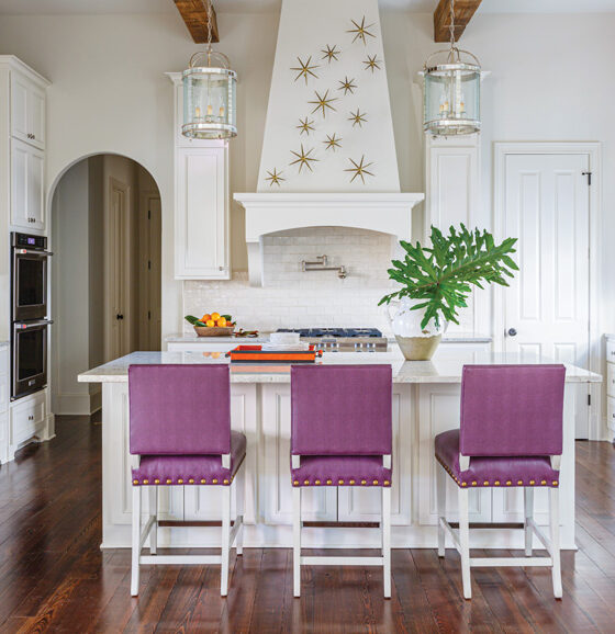
This kitchen renovation shines with a refined palette, thoughtful artistic details and hardworking functional features.
Getting a fresh perspective on a space sometimes requires being willing to start over. For interior designer Lauren Branch of Kéfi Home Interiors, a blank slate is exciting. An art major in college with an emphasis in textiles, Lauren loves working on the details. When she had the opportunity with her husband to rework her own home, a Mid Century Modern fixer upper, she began her journey into the world of home design and renovation. Now, as the owner of Kéfi Home Interiors, she gets to share her passion for creating beautiful spaces with others.
Lauren draws much of her design inspiration from blending together elements from the past and present. “Mixing old design styles with more modern color palettes and accessories usually ends up being what feels fresh and exciting to me to set me off in the right direction,” she says.
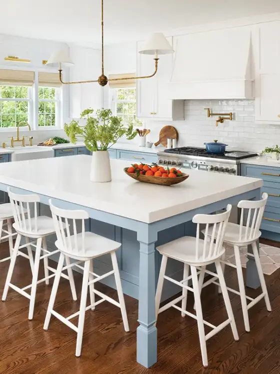
In this Raleigh, North Carolina, kitchen renovation, the homeowners wanted a complete overhaul of the original space. Built in 2003 by the previous homeowner, the design felt customized to that family and did not really mesh with the vision the new homeowners had. “This kitchen was the exact opposite of everything the homeowner wanted—functionally, aesthetically—the whole kit and kaboodle,” Lauren says. “So, when we started to ask ourselves, ‘Okay, what is the opposite of what is here?’ it naturally evolved. The function came first and the aesthetics followed.”
Balancing Act
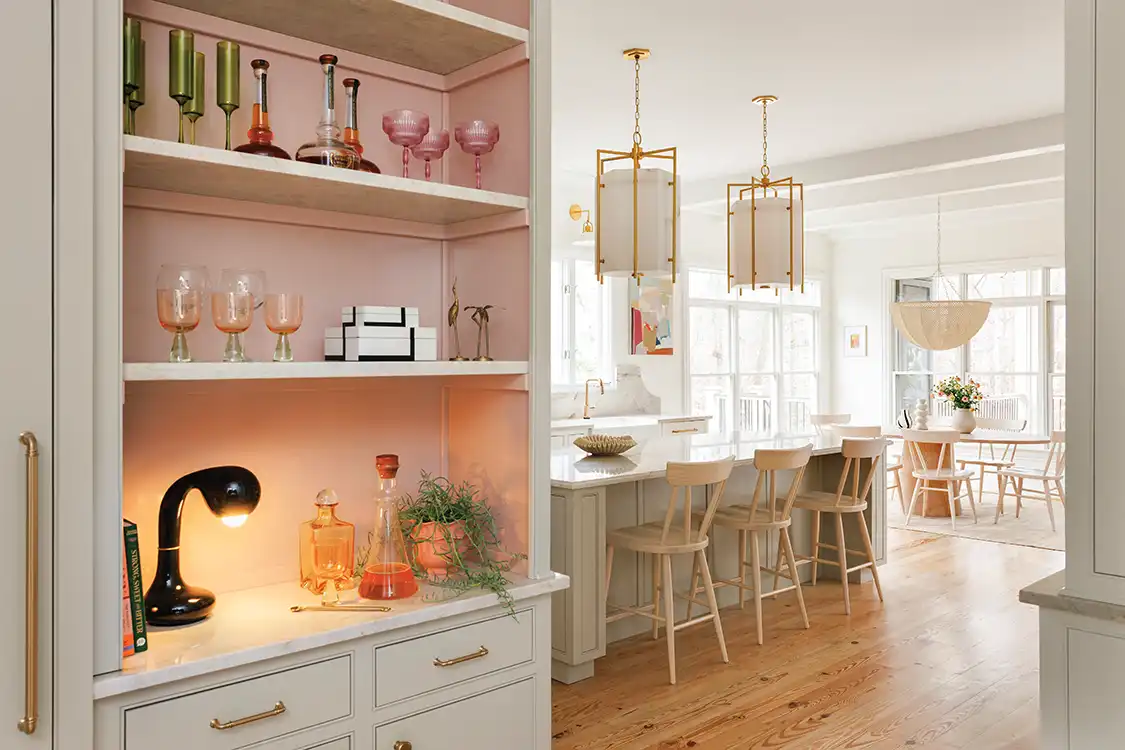
The active family of five with two dogs and a cat needed a kitchen that was able to withstand the daily wear and tear of living as well as hosting friends and family in larger gatherings. “They needed a space that could wear a variety of hats,” Lauren says. “They needed a lot of storage but also to maintain a feeling of openness. Aesthetically it needed a lightness to it, someplace welcoming and more friendly.” The kitchen had to serve both casual and fancy dining experiences, but the original layout and the flow felt off due to several odd angles and nonfunctioning nooks and crannies as well as a darker and heavier look and feel with lots of ornate detailing. While Lauren did not change much of the overall footprint, she did opt to move the entry door to the pantry to square the wall and create a larger bar area. This allowed for better utilization of the space and an improved workflow.
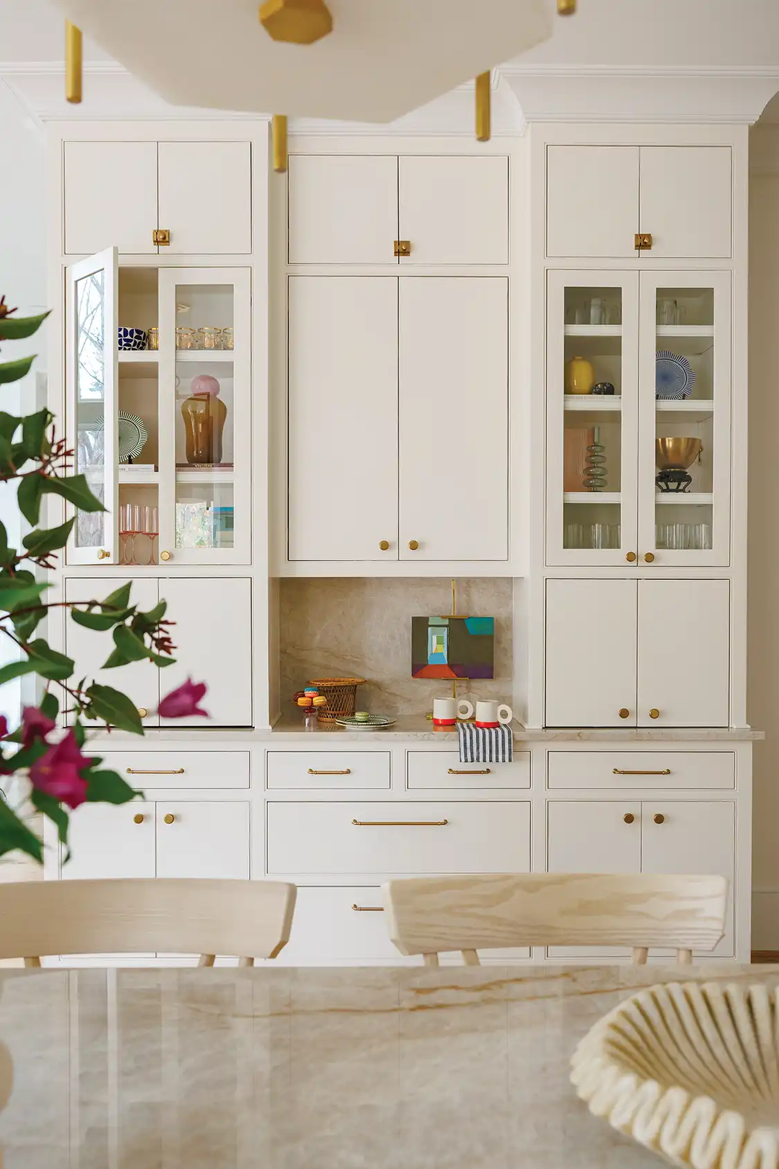
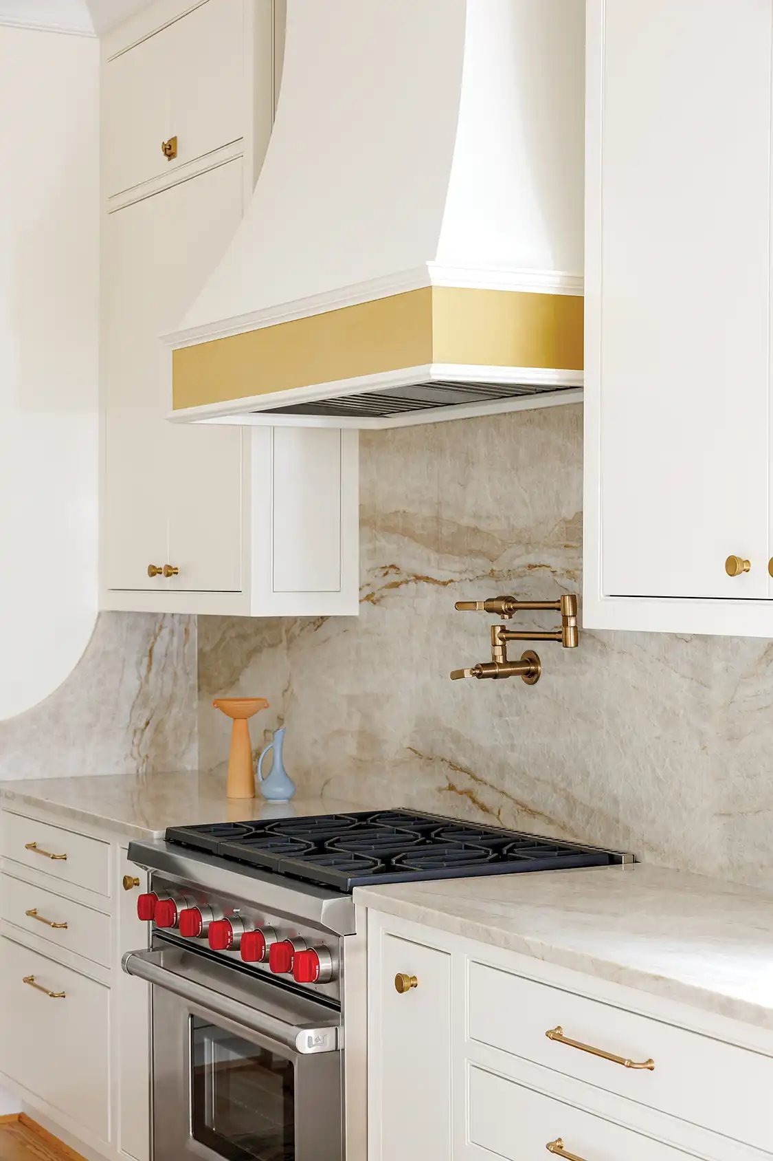
Bringing balance between style and function is no easy task in any home design, but in this renovation, Lauren was intent to allow for as much storage as possible while also letting in some natural light to create a brighter, airy feel. All design details the homeowners chose had to likewise make sense for their family and busy lifestyle. “The previous kitchen had too many intricate details that got chipped and cracked in the day-to-day usage, so we went with cabinet doors that were simpler and more streamlined,” Lauren explains. “The backsplash tile was small and the grout got dirty quickly, so we went with a full slab backsplash and did away with the grout issue altogether.”
Perfecting the Palette
After defining the functional necessities of the space, Lauren and the homeowners worked to find elements that created the desired look and feel. The palette provides a light and timeless ambience while also incorporating color and texture. “Trying to steer clear of an all-white kitchen while still bringing in some warmth, we decided to infuse fresh taupey browns mixed with pops of mauvy pink, some aged brass and pulling in a stone that brought it all together,” Lauren says. “It feels soft and earthy, and I really think the combination has a lot of longevity.”
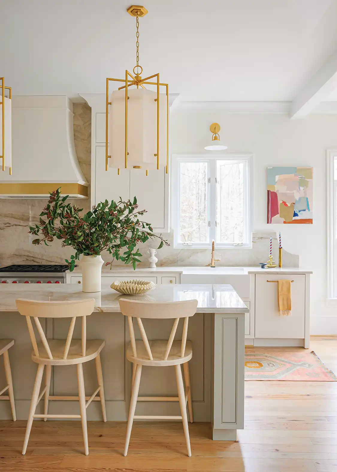
Lauren made sure to balance the palette from one side of the room to the other by utilizing details. “A vibrant abstract painting by Christina Baker really pops beautifully, pulls some of the mauvy pink over to the other side of the kitchen to create a sense of cohesiveness from one side to the other and is a nice modern balance to the more traditional cabinetry,” she says.
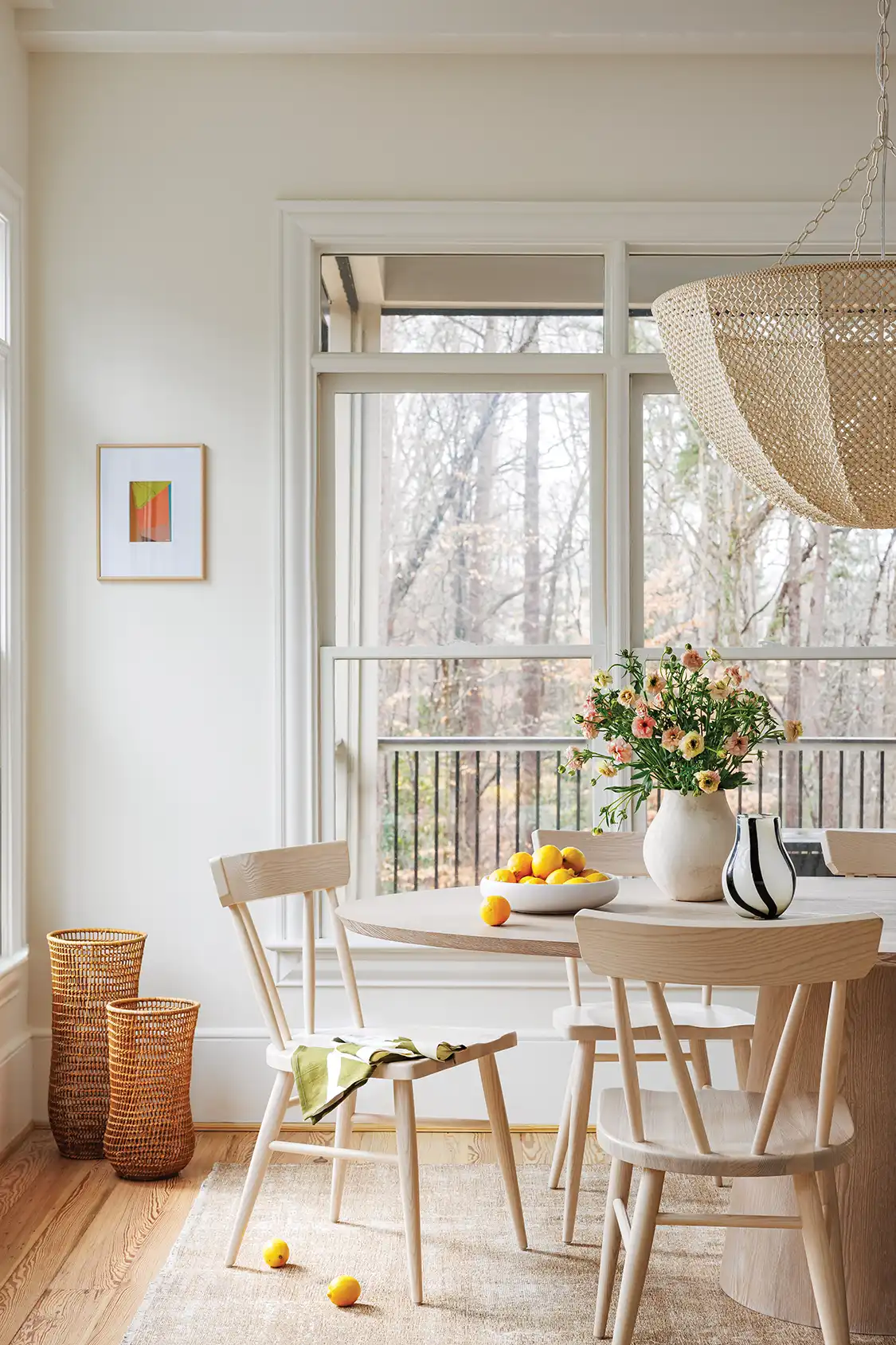
With refreshed lighting, a neutral yet colorful palette and functional updates that serve the aesthetic goals of the space, this kitchen and casual dining area feels welcoming, fun, personalized and elevated.
Shedding Light on Lighting
When working out your next kitchen and dining renovation, don’t overlook the impact lighting has on the overall look and feel of a space. This is especially the case if these areas lack natural lighting. Interior designer Lauren Branch offers her top tips on how to select the perfect light fixtures to get that wow factor you want while staying appropriate to the area.
- Get Even. When working out the placement of your lighting, be careful and deliberate. “Make sure the cans are placed evenly and either directly over or flanking major appliances and/or workspaces,” Lauren advises.
- Layer the Lighting. After you’ve covered the basic overall lighting of your space, like pendants over an island or recessed lights over the workspace, look at ways you can add in secondary lighting for a moodier feel. “Over a sink, a picture light for art, wall sconces near a hood, under cabinet lighting, etc., layering in different lighting elements feels more personal and gives the space more interest and depth,” Lauren says.
- Think Functionally. When selecting your lighting, keep in mind the material of the shade and the placement. “You may not want a fabric shade near your range top unless you want to be cleaning off potential food splatters,” Lauren says. “Don’t like to see dust? You may want to consider not using a clear glass shade and instead opting for frosted glass or a light without glass at all.”
- Keep Consistent. “If you’re putting in various lighting elements, ensure that you have the same lighting temperature throughout for a cohesive look,” Lauren says. “In a kitchen, I usually opt for a 3000K-3500K in kitchens and a warmer 2700K in other living spaces.”